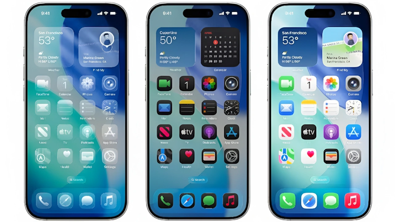
Apple has officially rolled out iOS 26, and with it comes one of the most dramatic design changes in recent years. The standout feature is the Liquid Glass interface, a sleek, translucent design that gives apps and menus a seamless, glass-like finish. While Apple is positioning this as a futuristic step in design, reactions among iPhone users have been mixed.
Why Users Are Divided
The Liquid Glass theme adds a sense of depth and elegance, but not everyone is a fan. Many users online have praised it for being modern and stylish, while others find the translucent interface distracting and harder to read. Apple attempted to balance the look by reducing transparency levels during beta testing, but the final release still keeps the glass effect prominent enough to spark debate.
Making iOS 26 Easier to Use
Although Apple has not provided an option to completely disable Liquid Glass, users can make it clearer and more practical by tweaking Accessibility Settings. Turning on features like Increase Contrast, Reduce Transparency, or Bold Text can significantly reduce the glassy effect, making text and icons easier to view. These settings allow users to keep the new design while improving clarity for everyday use.
The Future of iOS Design
With iOS 26, Apple has signaled its commitment to pushing bold design updates. Whether users embrace Liquid Glass fully or prefer toned-down adjustments, this release is shaping up to be one of the most talked-about iOS changes in years.